- 20 Mar, 2020
- read
- Karolinehc
Categories: Data Visualization Automotive Analytics
Tags: R Mtcars Corrplot Data Science Histogram Linear Regression Treemap Car Data Visualization
The content presented in this article is intended solely for academic purposes. The opinions expressed are based on my personal understanding and research. It’s important to note that the field of big data and the programming languages discussed, such as Python, R, Power BI, Tableau, and SQL, are dynamic and constantly evolving. This article aims to foster learning, exploration, and discussion within the field rather than provide definitive answers. Reader discretion is advised.
Metrics such as miles per gallon (mpg), the number of cylinders (cyl), engine displacement (disp), and other traditional indicators are now yielding to a new era characterized by the ascent of electric vehicles (EVs).
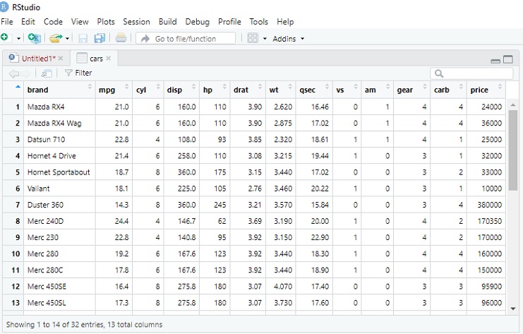
We’ll be working with automotive data using R language for Data Science. These headers represent different attributes for cars. Here’s a breakdown of what each header typically represents:
mpg: Miles per gallon (fuel efficiency)
cyl: Number of cylinders in the engine
disp: Engine displacement (cubic inches)
hp: Horsepower
drat: Rear axle ratio
wt: Car weight
qsec: Quarter mile time in seconds
vs: Engine type (0 = V-shaped, 1 = straight)
am: Transmission type (0 = automatic, 1 = manual)
gear: Number of forward gears
carb: Number of carburetors
DataSet
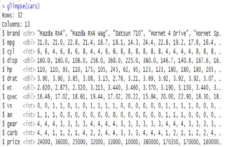
In the R programming language, the glimpse() function is part of the dplyr package and is used to get a concise summary of a dataset, providing a glimpse of its structure.
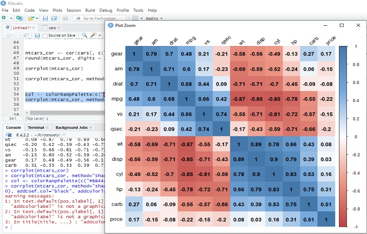
Corrplot: Correlation matrix (mtcars_cor) the cor() function by default calculates correlations only for numeric variables.
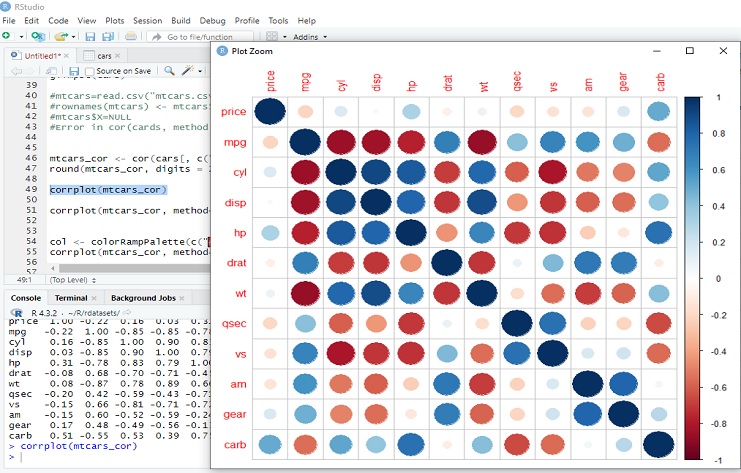
Corrplot: Positive Correlations:
Price and Carburetors (carb): 0.51
Horsepower (hp) and Carburetors (carb): 0.75
Weight (wt) and Engine Displacement (disp): 0.89
Weight (wt) and Number of Forward Gears (gear): 0.70
Negative Correlations:
Miles per Gallon (mpg) and Weight (wt): -0.87
Miles per Gallon (mpg) and Number of Forward Gears (gear): -0.55
Engine Cylinders (cyl) and Miles per Gallon (mpg): -0.85
Engine Type (vs) and Transmission Type (am): -0.72
Low Correlations:
Drat and Qsec: 0.09
Horsepower (hp) and Transmission Type (am): -0.24
Number of Forward Gears (gear) and Quarter Mile Time (qsec): -0.21
These correlation coefficients provide insights into the relationships between different car attributes. Positive correlations indicate that as one variable increases, the other tends to increase as well, while negative correlations suggest an inverse relationship. Low correlations imply weaker associations.
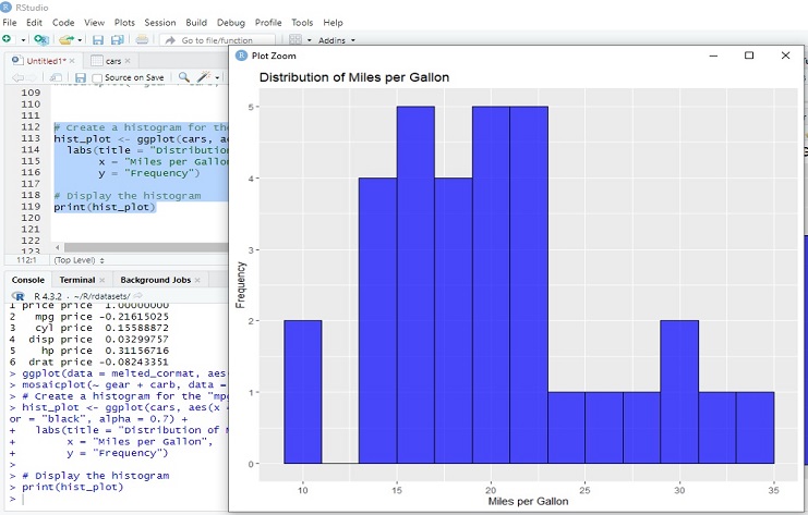
The purpose of this histogram is to visualize the distribution of miles per gallon (mpg) in the dataset represented by the ‘cars’ data frame. In summary, generates a histogram that visualizes the distribution of miles per gallon in the ‘cars’ dataset, providing insights into the frequency of different mpg values.
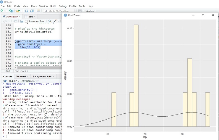
The resulting plot will show a histogram of horsepower values with a density plot overlay. In simpler terms, it gives you a smoothed representation of how the data is distributed along the numeric axis (in this case, horsepower). This can be helpful for understanding where the data is more concentrated.
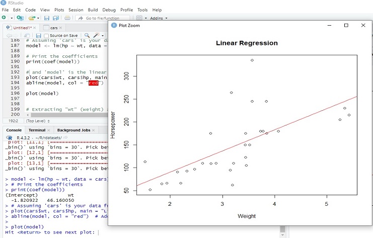
Fitting a linear regression model using the lm function in R. The model is predicting the variable hp (horsepower) based on the variable wt (car weight) from the data in the cars data frame.
(Intercept) wt
-1.820922 46.160050
(Intercept): This is the intercept term, representing the estimated value of horsepower when wt is zero.
wt: This is the coefficient for the variable wt (car weight). It represents the estimated change in horsepower for a one-unit increase in wt. In this case, the estimated increase in hp is approximately 46.16 for every one-unit increase in car weight.
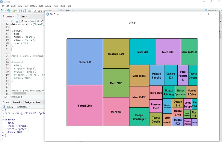
The resulting treemap visually represents the distribution of prices across different brands. Each rectangle in the treemap corresponds to a brand, and the size of the rectangle is proportional to the numeric values in the “price” column. This type of visualization is useful for comparing the relative sizes of different categories based on a numeric variable.
