- 23 Nov, 2023
- read
- Karolinehc
Categories: Data Projects Power BI Sales Analytics
Tags: Power BI Data Visualization Sales Data Customer Acquisition Bar Charts Pie Charts Dashboard Business Intelligence
The content presented in this article is intended solely for academic purposes. The opinions expressed are based on my personal understanding and research. It’s important to note that the field of big data and the programming languages discussed, such as Python, R, Power BI, Tableau, and SQL, are dynamic and constantly evolving. This article aims to foster learning, exploration, and discussion within the field rather than provide definitive answers. Reader discretion is advised.
Let’s journey through Power BI’s features, from visualization, and unlock the potential of the data like never before.
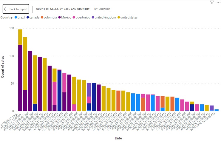
Let’s see the bar chart in Power BI with the title “Count Of Sales By Date And Country” and the X-axis representing “Count of Sales” and the Y-axis representing “Date,” we can make a few observations
Date and Country Analysis: The chart show the relationship between the count of sales, which is represented on the X-axis, and the date of sales, which is represented on the Y-axis. This means it’s analyzing how sales are distributed over time.
Countries Comparison: The chart compares the count of sales across different countries, Brazil, Canada, Colombia, Mexico, Puerto Rico, United Kingdom, and the United States. Each country have its own bar within the chart.
Sales Trends Over Time: By having “Date” on the Y-axis, the chart provide insights into how the count of sales changes over time. We can look for trends, seasonality, or anomalies in the data.
Comparison Across Countries: We can use the chart to compare how sales volumes differ among the mentioned countries over time. It can help us identify which countries have the highest and lowest sales counts.
Aggregate Sales Data: the chart represents aggregated or summarized sales data, as the Y-axis typically shows time-based data (in this case, “Date”) and the X-axis shows the measure being counted (in this case, “Count of Sales”).
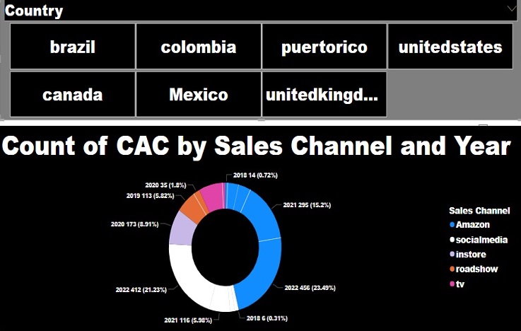
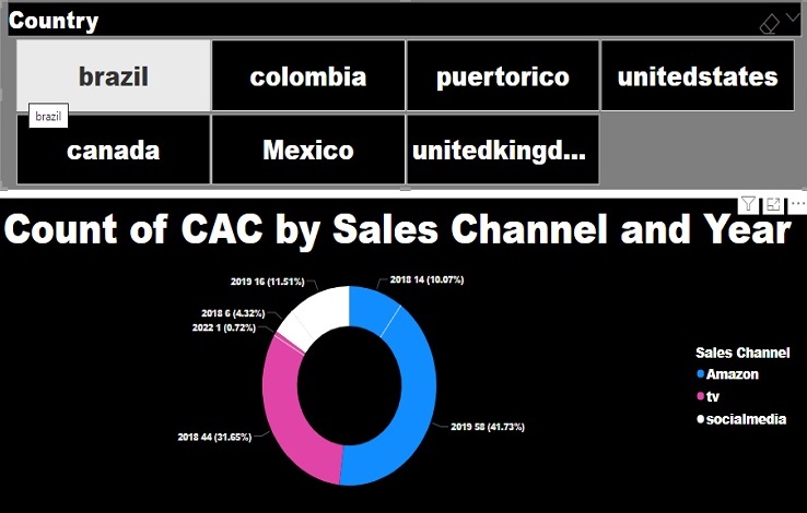
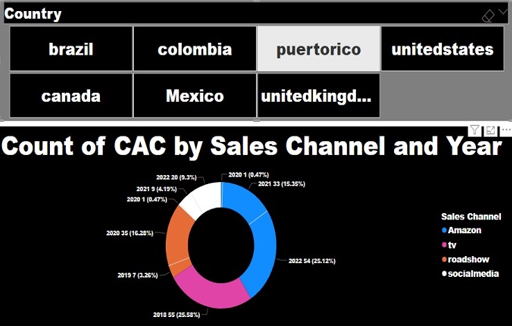
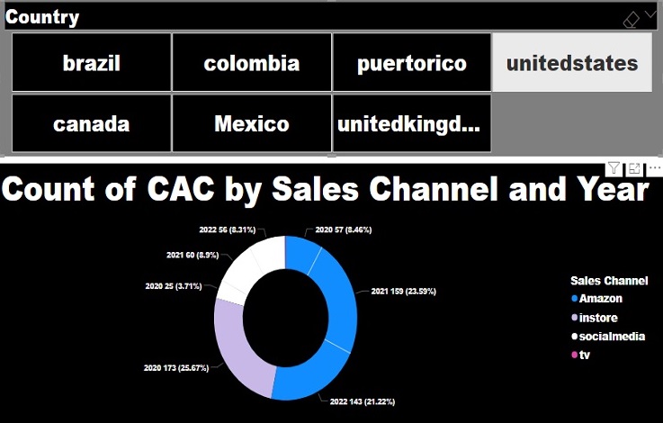
The title “Count of CAC by Sales Channel And Year” represents the count of customer acquisition costs (CAC) for different channels over different years.
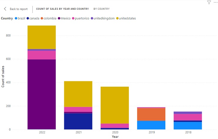
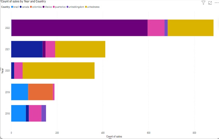
“Count of Sales by Year and Country” chart that breaks down sales counts for the year 2022 across different countries:
In 2022, there were 595 sales in Mexico.
There were 74 sales in Puerto Rico in 2022.
The United Kingdom had 14 sales in 2022.
The United States recorded 200 sales in 2022.
This chart effectively conveys the distribution of sales in the specified year (2022) among different countries, allowing us to quickly see how sales are spread across these regions. It’s a valuable tool for visualizing and comparing sales data by country, enabling data-driven decisions related to sales and market performance.
Sales Channels and Colors, Brazil country:
The pie chart represents multiple channels, each associated with a specific color: Amazon (blue), Social Media (white), and TV (pink).
For each channel, the chart provides statistics for the years 2018, 2021, and 2022.
It includes the count of CAC (Customer Acquisition Cost) for each year.
Additionally, it shows the percentage of CAC for each year in relation to the total for that channel
Sales Growth in 2022:
The chart indicates that there was a noticeable increase in sales in the year 2022 compared to the previous years.
This growth is visually represented by the higher bars in the chart for the year 2022.
Years Under Analysis: The chart focuses on the years 2018 to 2022, allowing us to analyze and compare sales data over this 5-year period.
The pie chart effectively conveys the distribution of CAC across different channels for the years 2018, 2019,2020, 2021, and 2022 for Puerto Rico. It provides a visual representation of the proportions and allows us to quickly compare the impact of CAC in each channel over these years.
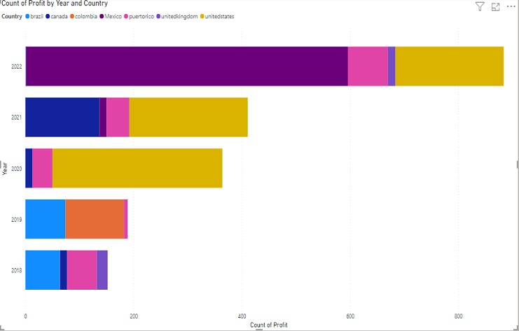
The chart “Count of Profit by Year and Country” provides a breakdown of profit counts for different countries and years.
In the chart, the X-axis represents “Count of Profit.”
The Y-axis displays years.
The legend shows different countries, including Mexico, the United States, Brazil.
Key points:
Mexico represents the highest percentage of profit records at 30.4%.
The United States is the second highest, accounting for 36.6% of the records.
The chart’s visual representation offers insights into the distribution of profit by year and country, highlighting the significant impact of Mexico and the United States on the overall distribution. It’s a valuable tool for assessing the profit distribution and market performance across different countries and years, helping to make informed business decisions.
Here’s a brief interpretation for United States:
Amazon (Blue):
In 2021, there were 159 CAC, accounting for 23.59% of the total for Amazon.
In 2022, there were 143 CAC, which is 21.22% of the total.
In 2020, there were 57 CAC, which is 8.46% of the total.
Social Media (White):
In 2021, there were 60 CAC, accounting for 8.9% of the total for Amazon.
In 2022, there were 56 CAC, which is 8.31% of the total.
In 2020, there were 25 CAC, which is 3.71% of the total.
InStore (Purple):
In 2020, there were 173 CAC, representing 25.67% of the total for InStore.
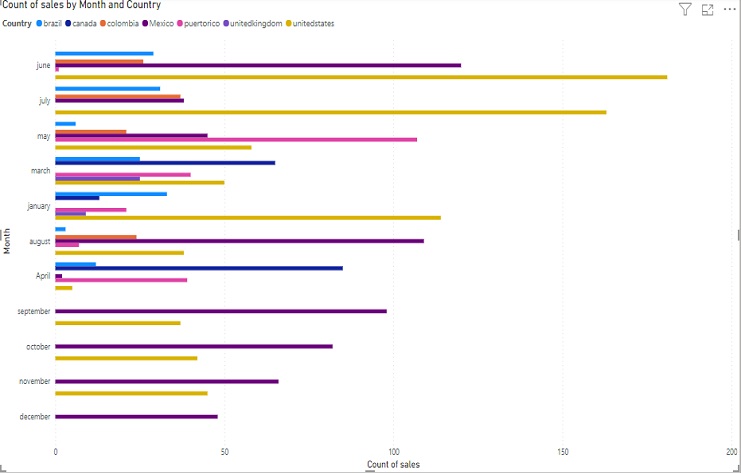
This data provides insights into the sales distribution for different months, showing how sales vary by country. It’s valuable for understanding the monthly sales performance across different countries, helping businesses make data-informed decisions and identify potential trends or areas for improvement in their sales strategies.
In June, there were 181 sales in the United States.
Colombia recorded 26 sales in the same month, June.
Mexico had 120 sales during June.
