- 23 Oct, 2023
- read
- Karolinehc
Categories: Data Projects Time Series Analysis
Tags: Python Time Series World Bank Net Migration Pandas Data Visualization South America Line Plot
The content presented in this article is intended solely for academic purposes. The opinions expressed are based on my personal understanding and research. It’s important to note that the field of big data and the programming languages discussed, such as Python, R, Power BI, Tableau, and SQL, are dynamic and constantly evolving. This article aims to foster learning, exploration, and discussion within the field rather than provide definitive answers. Reader discretion is advised.
Let’s dive into the world of net migration trends using data from the World Bank
World Bank. This dataset, meticulously organized in a tabular format, offers valuable insights into the migration patterns of nations worldwide.
import matplotlib.pyplot as plt
import pandas as pd
import numpy as np
We’ve brought in the essential Python tools for our analysis
netmigration15 = pd.read_csv(r'D:\helen\Documents\PythonScripts\datasets\WorldBank\netmigration.csv')
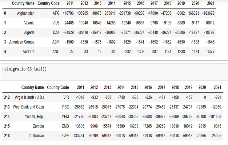
netmigration15.head()
netmigration15.tail()
Here’s a brief explanation of the columns:
Country Name: This column contains the names of different countries.
Country Code: This column contains the country codes, which are unique identifiers for each country.
2011 to 2021: These columns represent the net migration data for each year from 2011 to 2021. Positive values indicate net immigration (more people moving into the country than leaving), while negative values indicate net emigration (more people leaving the country than moving in).
This code will display the names of all the columns in the netmigration15 DataFrame.
Index(['Country Name', 'Country Code', '2011', '2012', '2013', '2014', '2015',
       '2016', '2017', '2018', '2019', '2020', '2021'],
      dtype='object')
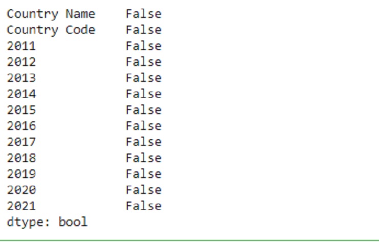
This code will display a list of columns along with True or False to indicate whether each column has missing values. If a column has missing values, it will show True; if not, it will show False.
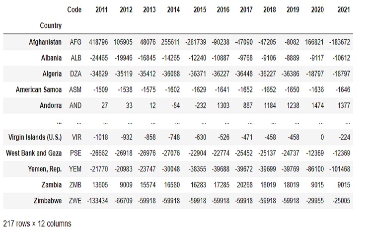
Setting the index of a DataFrame to the ‘Country’ column using netmigration15 will change the index of the DataFrame to the values in the ‘Country’ column.
netmigration15.set_index('Country', inplace=True)
This list can be useful for various data operations, particularly when we want to access or manipulate data for those specific years.
year = list(range(2011,2022))

year

OUTPUT
[2011, 2012, 2013, 2014, 2015, 2016, 2017, 2018, 2019, 2020, 2021]
This code will return the data for Colombia for the years 2011 to 2021.
years = [str(year) for year in range(2011, 2022)]
colombia_data = netmigration15.loc['Colombia', years]

years
OUTPUT

['2011',
 '2012',
 '2013',
 '2014',
 '2015',
 '2016',
 '2017',
 '2018',
 '2019',
 '2020',
 '2021']
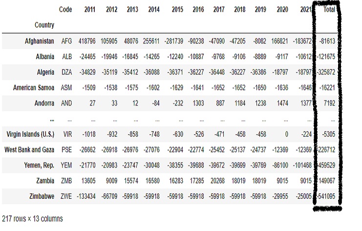
This is a common approach to calculate the total net migration for each country over the specified years.
numeric_columns = netmigration15.columns[2:]
netmigration15['Total'] = netmigration15[numeric_columns].sum(axis=1)
Negative net migration typically indicates that more people are leaving a country than entering it. Factors contributing to this trend may include:
Economic Conditions: Economic instability, high unemployment rates, or limited economic opportunities in the country can lead individuals to seek better prospects elsewhere.
Political Factors: Political instability, conflict, or lack of security can cause people to emigrate in search of a safer environment.
Social Factors: Social issues such as crime rates, lack of access to education, or healthcare can motivate people to leave.
Environmental Factors: Natural disasters, climate change, or environmental issues can force people to move due to the destruction of their homes or livelihoods.
Conflict or Violence: Ongoing conflict, violence, or civil unrest can drive people to flee their home countries.
Government Policies: Government policies related to immigration or emigration can impact population movements.
Demographic Changes: Changes in birth rates and fertility rates can also influence net migration numbers.
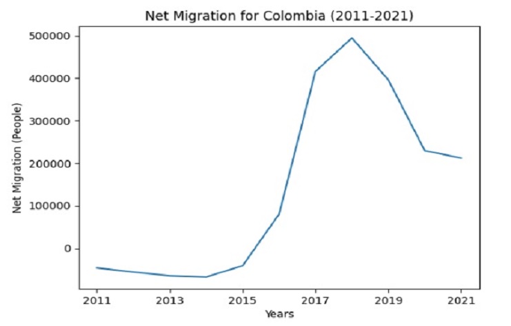
This is a good way to visually represent the net migration trends over the specified years.
colombia_data.plot()
plt.title('Net Migration for Colombia (2011-2021)')
plt.ylabel('Net Migration (People)')
plt.xlabel('Years')
plt.show()
Negative values indicate net emigration, meaning that more people are leaving Colombia to move to other countries than those coming into Colombia. In other words, Colombia experiences a net loss of population to other countries from 2011 to 2015.
Positive values indicate net immigration, meaning that more people are moving into Colombia than leaving it. From 2016 to 2021, Colombia experiences a net gain of population from international migration.
This is often done to ensure that all column names are of the same data type (in this case, as strings).
#Multiple Countries
netmigration15.columns = list(map(str,netmigration15.columns))
This is a useful step when working with column names or accessing specific columns in our DataFrame since the column names are typically stored as strings.
years = list(map(str,range(2011, 2022)))

years

OUTPUT

['2011',
 '2012',
 '2013',
 '2014',
 '2015',
 '2016',
 '2017',
 '2018',
 '2019',
 '2020',
 '2021']
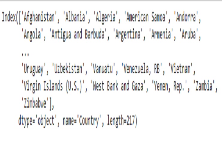
This code will display a list of all the unique countries that are present in the index of our DataFrame
unique_countries = netmigration15.index.unique()
print(unique_countries)
unique Countries
This is a common operation when you want to focus on a subset of countries or specific data for analysis or visualization.
netmigration15_SA= netmigration15.loc[['Colombia','Venezuela, RB', 'Brazil','Peru','Ecuador',
                                    'Bolivia','Chile','Paraguay','Uruguay','Argentina',
                                    ], years]
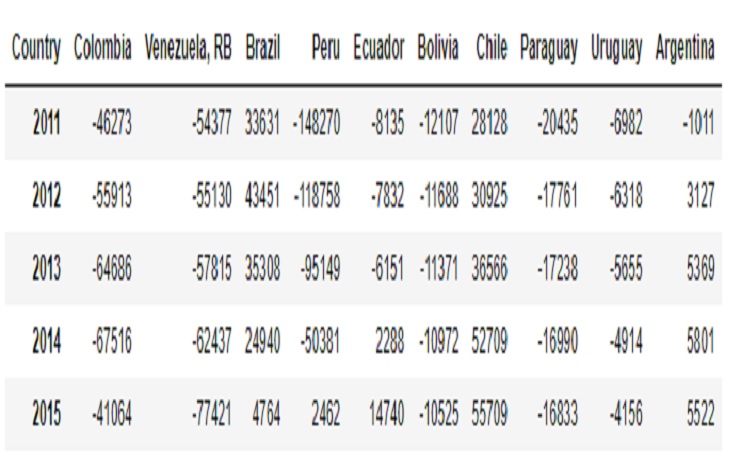
This operation is often done to make the data more suitable for visualization or analysis, especially when you want to plot multiple countries over the years.
netmigration15_SA = netmigration15_SA.transpose()
netmigration15_SA.head()
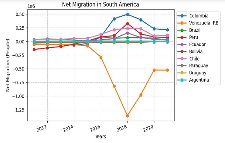
Countriesin South America over the years
Larger Figure Size: set a larger figure size (12x8) to make the plot more visible and detailed.
Line Styles and Markers: line styles and markers to distinguish the data for each country.
Title and Labels: a title, ylabel, and xlabel to provide context and information.
Gridlines: Gridlines have been added for better readability.
Legend: a legend with an adjusted location to help identify each country’s data.
X-Axis Spacing: Adjusted the spacing between the countries on the x-axis for better presentation.
Display: the plot using plt.show().
# Transpose the DataFrame for better visualization
netmigration15_SA = netmigration15_SA.transpose()

# Set a larger figure size
plt.figure(figsize=(12, 8))

# Plot the data with line styles and markers
netmigration15_SA.plot(kind='line', style='o-', markersize=6, linewidth=2)

# Set the title, ylabel, and xlabel
plt.title('Net Migration in South America')
plt.ylabel('Net Migration (People)')
plt.xlabel('Years')

# Add gridlines for better readability
plt.grid(True, linestyle='--', alpha=0.6)

# Add legend with adjusted location
plt.legend(loc='upper left', bbox_to_anchor=(1, 1))

# Add some space between the countries on the x-axis
plt.xticks(rotation=20, ha='right')
plt.subplots_adjust(bottom=0.2)

# Show the plot
plt.show()
So, in summary:
Negative values suggest a decrease in population due to more people leaving.
Positive values suggest an increase in population due to more people arriving.
During Juan Manuel Santos’ presidency, he initiated and successfully led negotiations with the Revolutionary Armed Forces of Colombia (FARC) guerrilla group to reach a historic peace agreement. The peace talks with the FARC began in 2012 and ultimately led to the signing of the peace agreement in 2016. This agreement marked a significant milestone in Colombia’s history, as it aimed to end decades of armed conflict and bring about a more peaceful and stable future for the country.
The peace agreement addressed a wide range of issues, including disarmament, reintegration of former combatants into society, rural development, and justice for victims of the conflict. The pursuit of peace and the implementation of this agreement were among the key policy priorities during Santos’ presidency and would have had a significant impact on the social and political landscape of Colombia during those years. These efforts could certainly be a relevant factor when considering the dynamics of migration and other aspects of Colombian society during that period (2016-2021).
