- 23 Nov, 2023
- read
- Karolinehc
Categories: Customer Analytics E-commerce Projects
Tags: Customer Recency Revenue Analysis Pandas Correlation Seaborn Customer Behavior Data Visualization Python
The content presented in this article is intended solely for academic purposes. The opinions expressed are based on my personal understanding and research. It’s important to note that the field of big data and the programming languages discussed, such as Python, R, Power BI, Tableau, and SQL, are dynamic and constantly evolving. This article aims to foster learning, exploration, and discussion within the field rather than provide definitive answers. Reader discretion is advised.
By calculating “days since,” we gain a temporal perspective on customer transactions, enabling more informed decision-making in areas like customer relationship management, marketing, and business strategy.
Let’s start importing some essential libraries for data analysis, visualization, and statistical modeling. Including datetime from the datetime module in Python is useful for working with date and time data
import pandas as pd
import numpy as np
import seaborn as sns
import matplotlib.pyplot as plt
from statsmodels.formula.api import ols
import random
from datetime import datetime
Loading the data
ecommerce = pd.read_csv(r'D:\helen\Documents\PythonScripts\datasets\ecommerce\shop3_CustomerID.csv')
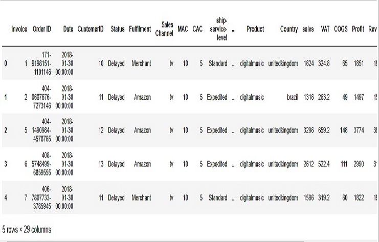
Let’s see the first lines of the data
ecommerce.head()
Data
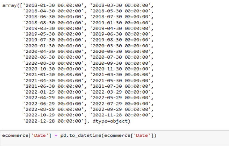
pd.to_datetime
ecommerce['Date'] = pd.to_datetime(ecommerce['Date'])
We used pd.to_datetime to convert a column to a datetime format. The datetime module in Python provides additional functionality for working with dates and times, such as creating datetime objects, performing arithmetic operations, and formatting dates
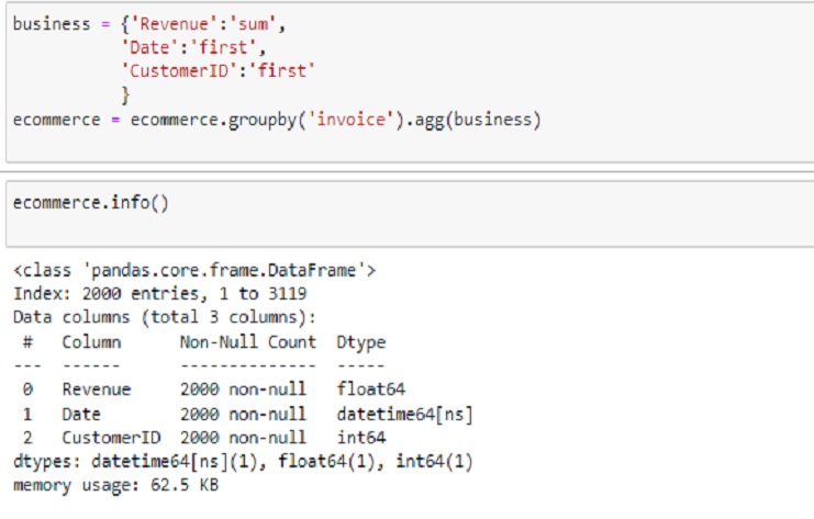
‘Revenue’:‘sum’: Sum the ‘Revenue’ values within each group.
‘Date’:‘first’: Take the first ‘Date’ value within each group.
‘CustomerID’:‘first’: Take the first ‘CustomerID’ value within each group
business = {'Revenue':'sum',
           'Date':'first',
           'CustomerID':'first'
           }
ecommerce = ecommerce.groupby('invoice').agg(business)
Information
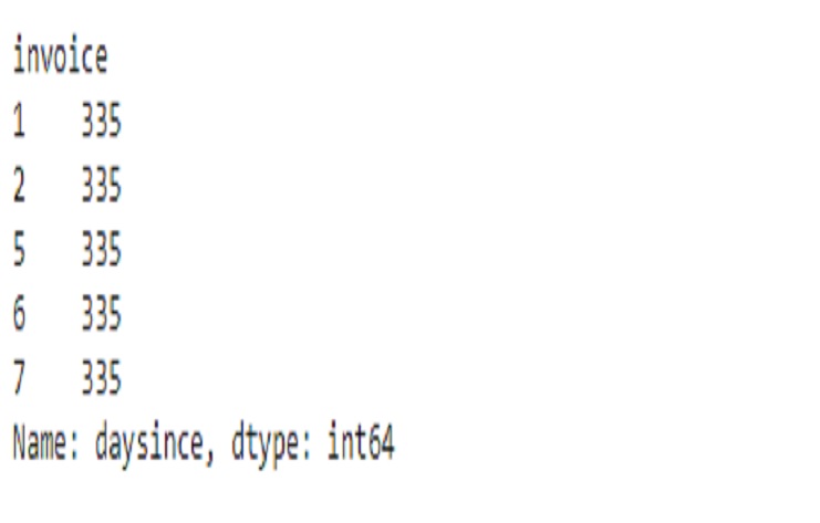
The resulting ‘daysince’ column represents the number of days between each date in the ‘Date’ column and December 31, 2018.
ecommerce['Date'] = pd.to_datetime(ecommerce['Date'])

# Calculate the number of days since December 31, 2018
ecommerce['daysince'] = (pd.to_datetime('2018-12-31') - ecommerce['Date']).dt.days

# Display the first few rows
print(ecommerce['daysince'].head())
It’s a common technique used in time-based analysis to measure the recency of events relative to a specific reference date.
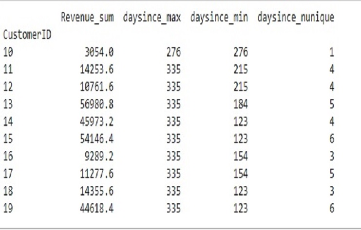
This table performs several operations on an ’ecommerce’ DataFrame, focusing on the year 2019.
The final output, ‘X,’ provides aggregated information for each ‘CustomerID’ in the year 2019, including the sum of revenue and various statistics related to the ‘daysince’ column.
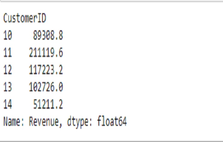
This code snippet filters the ’ecommerce’ DataFrame for the year 2022, groups the data by ‘CustomerID,’ and calculates the sum of ‘Revenue’ for each customer.
# Filter the DataFrame for the year 2022
y = ecommerce[ecommerce['Year'] == pd.to_datetime(2022, format='%Y')].groupby('CustomerID')['Revenue'].sum()

# Display the first few rows of 'y'
print(y.head())
The output is a Pandas Series with ‘CustomerID’ as the index and the sum of ‘Revenue’ as the values.
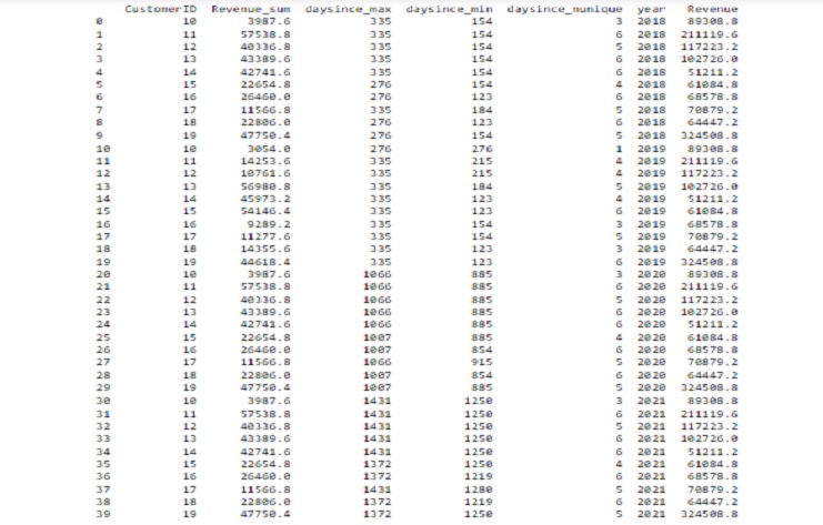
This code snippet merges two DataFrames, ‘X18192021’ and ‘y,’ based on the ‘CustomerID’ column using a left join. It then displays the first 40 rows of the merged DataFrame ’transaction.
pd.set_option('display.width', 100)  # Adjust the width as needed
pd.set_option('display.max_columns', None)  # Display all columns without truncation
# Merge DataFrames on 'CustomerID'
transaction = pd.merge(X18192021, y, on='CustomerID', how='left')

# Display 40 rows of the merged DataFrame
print(transaction.head(40))
The resulting output show a DataFrame with columns from both ‘X18192021’ and ‘y,’ merged based on the ‘CustomerID’ column..
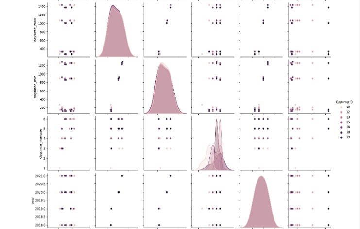
This code snippet uses Seaborn’s pairplot function to create a pairwise scatter plot matrix for the columns in the ’transaction’ DataFrame.
Each point on the scatter plot represents a row in the DataFrame, and the plots on the diagonal show the distribution of each individual column.
The hue parameter is set to ‘CustomerID,’ meaning that different colors are used for different customer IDs.
The resulting pair plot provides a visual overview of the relationships between the numerical columns in the DataFrame.
# Use sns.pairplot
sns.pairplot(transaction, hue='CustomerID')
plt.show()
Correlations are linear relationships between two variables. They can be positive as one variable increases, the other increase or negative as one increases, the other decreases.
Correlation does not imply causation, and a high correlation does not necessarily mean a causal relationship between variables.
The correlation coefficient ranges from -1 to 1.
Values close to 1 indicate a strong positive correlation (as one variable increases, the other tends to increase).
Values close to -1 indicate a strong negative correlation (as one variable increases, the other tends to decrease).
Values close to 0 indicate a weak or no linear correlation.
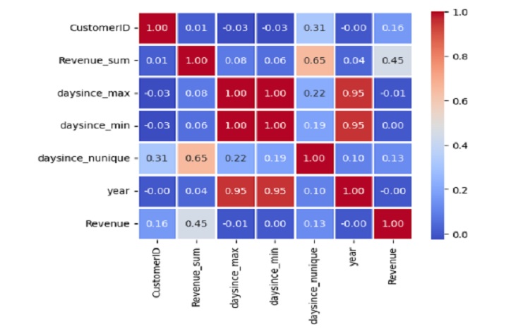
# Display the correlation matrix with annotated values
correlation_matrix = transaction.corr()
sns.heatmap(correlation_matrix, annot=True, cmap='coolwarm', fmt='.2f', linewidths=1, square=True)
Positive correlation between ‘Revenue_sum’ and ‘year’ (0.046718), suggesting that there is a positive relationship between the total revenue and the year.
Strong positive correlation between ‘daysince_max’ and ‘daysince_min’ (0.996825), indicating that these two variables are highly correlated.
Moderate positive correlation between ‘Revenue_sum’ and ‘daysince_nunique’ (0.648330), suggesting that there may be a positive relationship between total revenue and the number of unique days since the specified date.
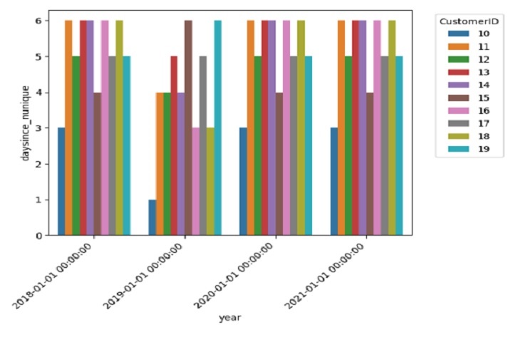
y-axis (‘daysince_nunique’): Each bar represents the number of unique values of ‘daysince’ for a specific ‘CustomerID’. This can give us an idea of how many distinct recency values each customer has.
x-axis (‘year’): The plot is divided into different years, allowing us to observe how the distribution of recency values changes over time.
Hue (‘CustomerID’): Each ‘CustomerID’ is represented by a different color. This allows us to see how the recency values vary within each customer across different years.
