- 23 Oct, 2023
- read
- Karolinehc
Categories: Data Visualization Python Projects
Tags: Plotly COVID-19 Python Choropleth Maps Pandas Healthcare Data Interactive Charts Global Statistics
The content presented in this article is intended solely for academic purposes. The opinions expressed are based on my personal understanding and research. It’s important to note that the field of big data and the programming languages discussed, such as Python, R, Power BI, Tableau, and SQL, are dynamic and constantly evolving. This article aims to foster learning, exploration, and discussion within the field rather than provide definitive answers. Reader discretion is advised.
In recent times, our world has been deeply impacted by the COVID-19 pandemic Who WHO, a global health crisis that brought unprecedented challenges and changes to our daily lives. The pandemic highlighted the importance of data analysis and visualization in understanding the spread of the virus, its impact on different regions, and the effectiveness of public health measures. One powerful tool for visualizing such data is Plotly, a Python library that allows us to create interactive and informative plots and charts. In this context, we’ll explore how Plotly PLOTLY can help us gain insights into the ever-evolving COVID-19 situation.
import pandas as pd
import numpy as np
import seaborn as sns
import matplotlib.pyplot as plt
from statsmodels.formula.api import ols
import plotly.graph_objects as go
import plotly.express as px
covid0 = pd.read_csv(r'D:\helen\Documents\PythonScripts\datasets\turi\covid_data.csv')

covid0.head()
In this case, Afghanistan had an estimated population of around 39 million people on December 31, 2019.
for every 1,000 people living in Afghanistan, there were, on average, half of a hospital bed available for their use

NAN = [(c,covid0[c].isna().mean()*100) for c in covid0]
NAN = pd.DataFrame(NAN, columns=['column_name', 'percentage'])
NAN
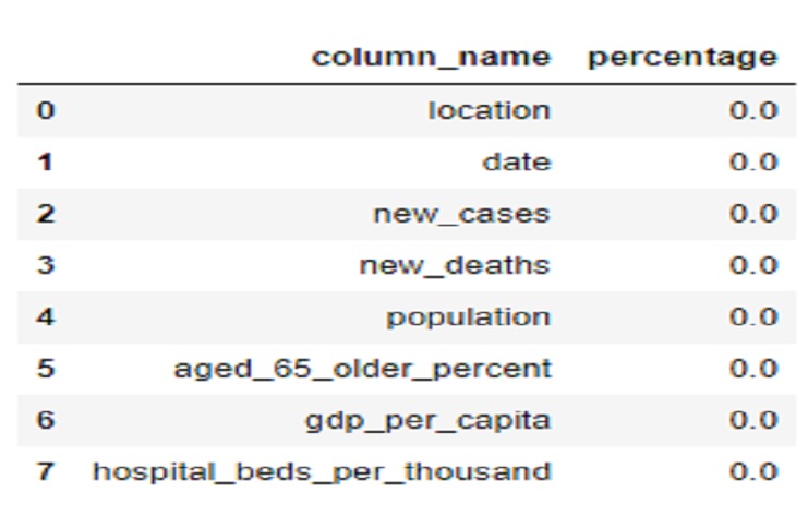
There is no missing values
covid0.describe()
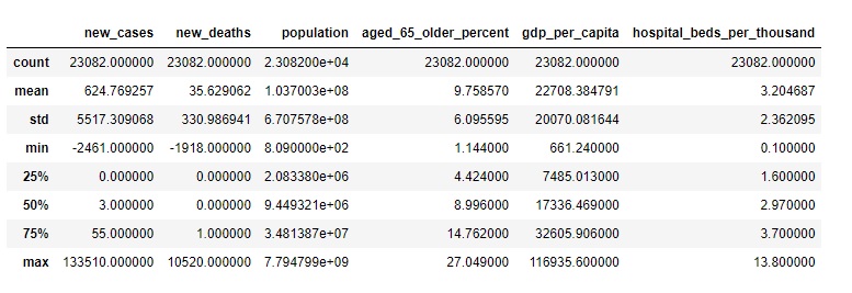
Statistics: The difference between the mean and the 50th percentile (median) for the “population” column is significant.
The mean population is approximately 103,700,300 (1.037003e+08), which is the average population across all the data points in the dataset.
The 50th percentile (median) population is approximately 9,449,321. This value represents the middle point of the population data when it’s arranged in ascending order. It’s not influenced by extremely high or low values.
The difference between these two values shows that the mean population is significantly higher than the median population. This suggests that there are some countries with very large populations that are skewing the mean, making it much higher than the population in most countries. The median, on the other hand, gives us a sense of the “typical” population, which is much lower than the mean due to the influence of the few countries with very high populations.
covid0[covid0['location']=='Colombia']
for the Colombian case, on June 6, 2020, there were 1,515 new cases of COVID-19 and 58 new deaths reported. As for additional descriptions:
Population: The estimated population of Colombia at that time was approximately 50,882,884 people.
Aged 65 and Older Percent: The percentage of the population aged 65 or older was 7.646%, indicating that about 7.646% of the population was within the 65 years or older age group.
Hospital Beds per Thousand: There were approximately 1.71 hospital beds available per 1,000 inhabitants in Colombia, meaning there were about 1.71 hospital beds for every 1,000 people living in Colombia.
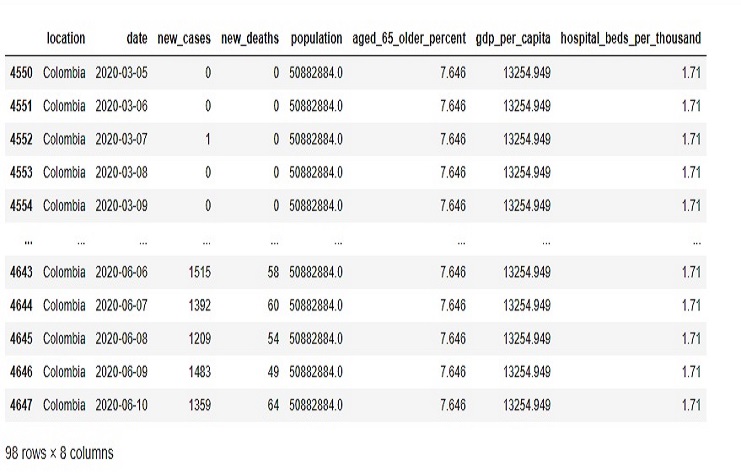
fig = go.Figure(go.Bar(
x=covid0_goon['date'],
y=covid0_goon['new_cases'],
))
fig.update_layout(
title='Cases day by day',
template='plotly_white',
xaxis_title='Cases',
yaxis_title='Days',
)
fig.show()
This code creates a bar chart that visualizes the ’new_cases’ data over time, with the date on the x-axis and the number of new cases on the y-axis. It also sets titles and the plot template for a clean and informative display.
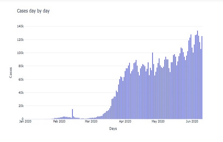
fig = px.choropleth(covid0_countries, locations=covid0_countries['Country'],
                   color=covid0_countries['Total Cases'],locationmode='country names',
                   hover_name=covid0_countries['Country'],
                   color_continuous_scale=px.colors.sequential.OrRd, template='plotly_dark',)
fig.update_layout(
title='Cases per Country',
)
fig.show()
The result is a choropleth map that visualizes the number of COVID-19 cases per country, using color to represent the ‘Total Cases’ values for each country. The map allows us to hover over countries to see additional information and is presented with a dark background for better visibility.
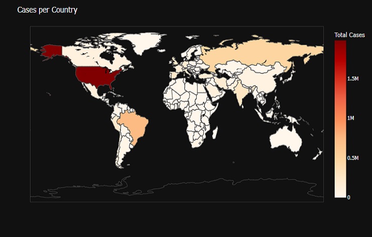
fig = px.choropleth(covid0_countries_pop, locations=covid0_countries_pop['location'],
                   color=covid0_countries_pop['Beds Per Thousand'], locationmode='country names',
                   hover_name=covid0_countries_pop['location'],
                   color_continuous_scale=px.colors.sequential.OrRd, template='plotly_dark',)
fig.update_layout(
    title='Beds per Country',
)
fig.show()
The result is a choropleth map that visualizes the number of hospital beds per thousand inhabitants in each country. The color of each country is based on the ‘Beds Per Thousand’ values. Hovering over a country displays its name, and the map is presented with a dark background for better visibility.
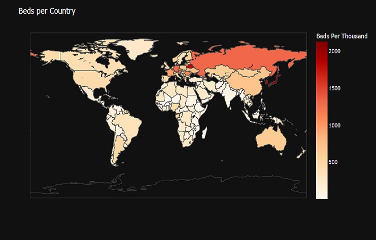
fig = go.Figure()
fig.add_trace(go.Scatter(x = covid0_co['date'], y = covid0_co['new_cases'],
                        mode='lines',
                        name='Cases in Colombia'))

fig.add_trace(go.Scatter(x = covid0_bz['date'], y = covid0_bz['new_cases'],
                        mode='lines',
                        name='Cases in Brazil'))

fig.update_layout(
title='Cases in South America',
template='plotly_white'
)
fig.show()
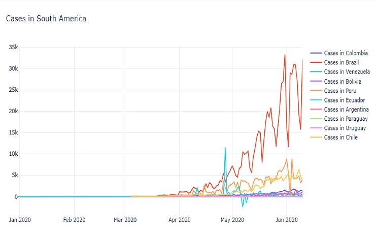
The result is a line chart that shows the daily new COVID-19 cases in various South American countries and one additional location over time. The chart provides insights into the trends of new cases in these regions.
