- 23 Sep, 2023
- read
- Karolinehc
Categories: Digital Marketing Python Projects
Tags: Google Ads Call Reporting Campaign Optimization Device Analysis Ad Position Pandas Seaborn Python Visualization
The content presented in this article is intended solely for academic purposes. The opinions expressed are based on my personal understanding and research. It’s important to note that the field of big data and the programming languages discussed, such as Python, R, Power BI, Tableau, and SQL, are dynamic and constantly evolving. This article aims to foster learning, exploration, and discussion within the field rather than provide definitive answers. Reader discretion is advised.
With Call Reporting, you can gain a better understanding of how your call-focused campaigns are performing, when customers are most likely to call, and which campaigns or keywords are driving the most calls. This information can help you optimize your campaigns and make data-driven decisions to improve your advertising strategy.
import pandas as pd
import numpy as np
import seaborn as sns
import matplotlib.pyplot as plt
from statsmodels.formula.api import ols
from IPython.display import display
call = pd.read_csv(r'D:\helen\Documents\Python\datasets\callreport.csv')
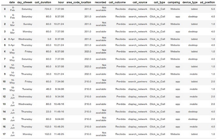
call.head(20)
call.head(20)
OUTPUT seeing our dataset
call.shape
(100,2)
call_complete = call.dropna()
print(call_complete.isna().sum())
The sum() method is used to calculate the sum of boolean values, which are generated by the isna() method to indicate missing values (NaN) in your DataFrame. This will give you the count of missing values for each column in the call_complete DataFrame.
OUTPUT
|date—————|:——————-:|0—-:| |day_ofweek———|:——————-:|0—-:| |call_duration——|:——————-:|0—-:| |hour—————|:——————-:|0—-:| |area_code_location-|:——————-:|0—-:| |recorded ———-|:——————-:|0—-:| |call_outcome ——|:——————-:|0—-:| |call_source ——-|:——————-:|0—-:| |call_type ———|:——————-:|0—-:| |campaing ———-|:——————-:|0—-:| |device_type ——-|:——————-:|0—-:| |ad_position ——-|:——————-:|0—-:| dtype: int64
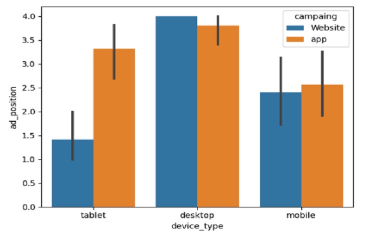
Here, the pivot_table function will use the mean (average) aggregation function to calculate the values for each cell in the pivot table. Therefore, the resulting pivot table will show the average “ad_position” values for each combination of “device_type” and “campaing”
call_by_campaing = call.pivot_table('ad_position', index="device_type", columns="campaing")
print(call_by_campaing)
OUTPUT
| campaing | Website | app |
|---|---|---|
| device_type | ||
| ———– | :——-: | ——-: |
| desktop | 4.000000 | 3.800000 |
| mobile | 2.409091 | 2.565217 |
| tablet | 1.421053 | 3.312500 |
Everything is more understandable using a visualization.
Data visualization using libraries like Seaborn (sns) in Python can greatly enhance our understanding of the data and make patterns, trends, and relationships more apparent. Lets see!!!
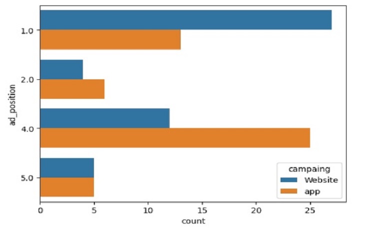
When we run this code, it will generate a countplot where each bar represents the count of occurrences for different “ad_position” values, and the bars are grouped by “campaing” using different colors. So in this case the campaping for website is showing up a High Ad Position If your ad appears in one of the top positions on the search results page (e.g., position 1 or 2), it’s more likely to be seen by users, and they might find it convenient to click on the call extension and initiate a call directly from the ad. Users who are actively searching for your product or service and see your ad prominently displayed are more likely to engage with the call extension.
sns.countplot(data=call,
         y="ad_position",
         hue="campaing")

plt.show()
plt.clf()
OUTPUT
sns.barplot(data=call,
         y='ad_position',
         x='device_type',
         hue='campaing')

plt.show()
plt.clf()
In this context,
The visualization aims to show how users’ device types (such as mobile devices, tablets, or desktops) influence the ad position and the campaigns they interact with. The hue parameter allows you to differentiate and compare different campaigns within each device type.
OUTPUT
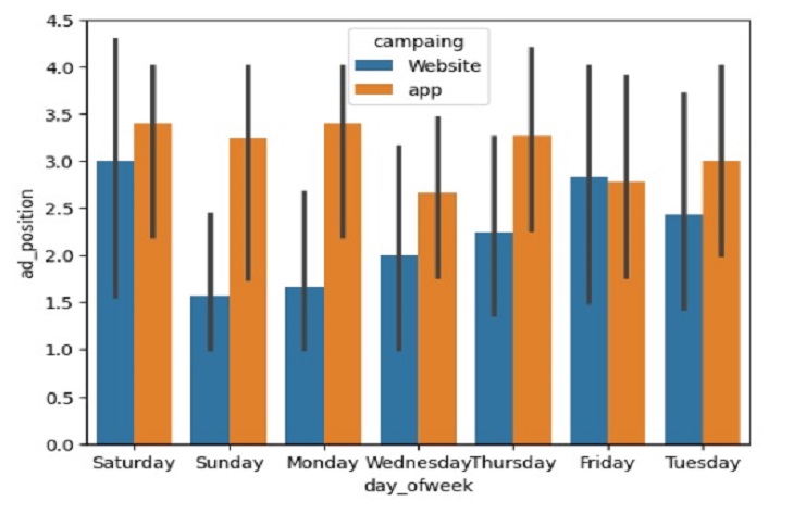
sns.barplot(data=call,
         y='ad_position',
         x='day_ofweek',
         hue='campaing')

plt.show()
plt.clf()
For this scenario,
The visualization show the relationship between the day of the week (x-axis), the ad position (y-axis), and the different campaigns (hue). By analyzing this plot, we can determine on which days users tend to click more on ad calls, how ad positions affect user engagement on different days, and which campaigns are performing well on specific days of the week
OUTPUT
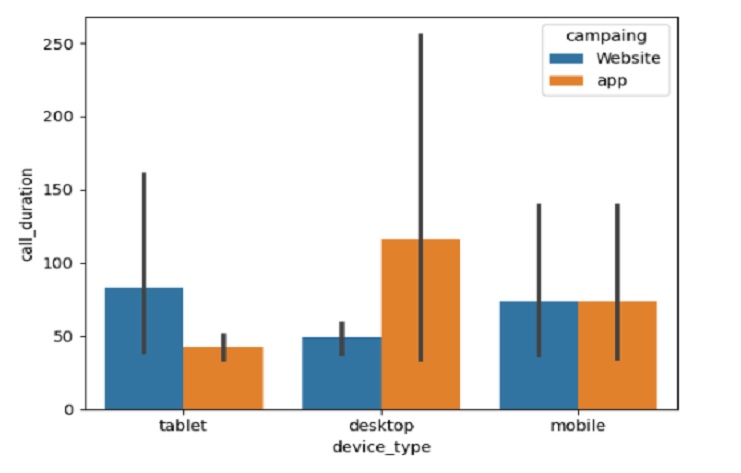
sns.barplot(data=call,
         y='call_duration',
         x='device_type',
         hue='campaing')

plt.show()
plt.clf()
OUTPUT
