- 23 May, 2023
- read
- Karolinehc
Categories: Data Visualization Python Projects
Tags: Ifood Dataset Customer Data Pandas Matplotlib Seaborn Kaggle Marketing Data Data Cleaning
The content presented in this article is intended solely for academic purposes. The opinions expressed are based on my personal understanding and research. It’s important to note that the field of big data and the programming languages discussed, such as Python, R, Power BI, Tableau, and SQL, are dynamic and constantly evolving. This article aims to foster learning, exploration, and discussion within the field rather than provide definitive answers. Reader discretion is advised.
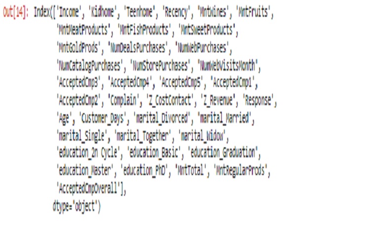
marketing1.columns
OUTPUT
marketing1['marital_Divorced'].unique()
OUTPUT
array([0, 1], dtype=int64)
marketing1['education_Basic'].unique()
OUTPUT
array([0, 1], dtype=int64)
marketing1['kidhome'].unique()
OUTPUT
array([0, 1, 2], dtype=int64)
marketing1['AcceptedCmp5'].unique()
OUTPUT
array([0, 1], dtype=int64)
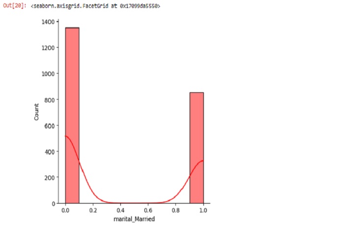
sns.displot(marketing1.marital_Married, bins=10, kde=True, color='red')
marital_
Creating new string Columns for a current int64 Columns
Les’t convert some variables from dtype int64 like: marital , education , _home and AcceptedCmp1 to string to make more understandable the visualization .
import numpy as np

marital_mapping = {
    0: 'Not Divorced',
    1: 'Divorced',
    0: 'Not Together',
    1: 'Together',
    0: 'Not Widow',
    1: 'Widow',
    0: 'Not Single',
    1: 'Single',
    0: 'Not Married',
    1: 'Married'
}

marketing1['maritalstatus'] = np.where(marketing1['marital_Divorced'] == 1, 'Divorced', 'Not Divorced')
marketing1['maritalstatus'] = np.where(marketing1['marital_Married'] == 1, 'Married', marketing1['maritalstatus'])
marketing1['maritalstatus'] = np.where(marketing1['marital_Single'] == 1, 'Single', marketing1['maritalstatus'])
marketing1['maritalstatus'] = np.where(marketing1['marital_Together'] == 1, 'Together', marketing1['maritalstatus'])
marketing1['maritalstatus'] = np.where(marketing1['marital_Widow'] == 1, 'Widow', marketing1['maritalstatus'])
Let’s apply the same code to get education variable and the levels too.
marketing1.loc[0,'Customer_Days']
OUTPUT
2822
In the case above we need to change the current dtype int65 to a datetime because Customer_Days is date variable
marketing1['Customer_Days'] = pd.to_numeric(marketing1['Customer_Days'], errors='coerce')
marketing1['Customer_Days'] = pd.to_datetime(marketing1['Customer_Days'], origin='1970-01-01', unit='D')

start_date = pd.to_datetime('1976-01-01')
end_date = pd.to_datetime('1977-12-31')

accurate_dates = marketing1[(marketing1['Customer_Days'] >= start_date) & (marketing1['Customer_Days'] <= end_date)]['Customer_Days']
#let's switch from int dtype to string dtype (Object) the new follow variables
marketing1['maritalstatus'] = marketing1['maritalstatus'].astype(str)
marketing1['education'] = marketing1['education'].astype(str)
marketing1['campaing'] = marketing1['campaing'].astype(str)
marketing1['family'] = marketing1['family'].astype(str)
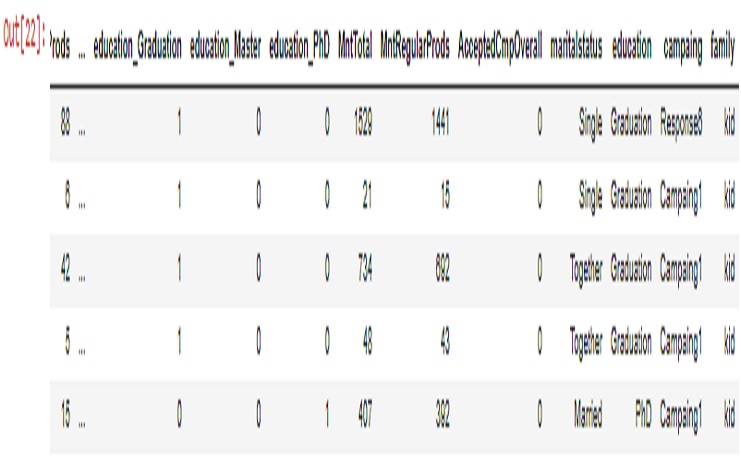
marketing1.head()
OUTPUT
graphic_date.plot(x='Customer_Days', y='Income', kind = 'line')
OUTPUT
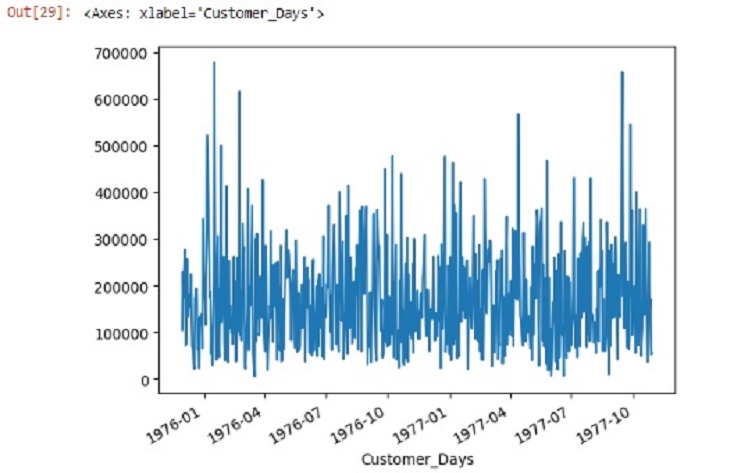
graphic_date.plot(x='Customer_Days', y='Income', kind = 'line')
OUTPUT
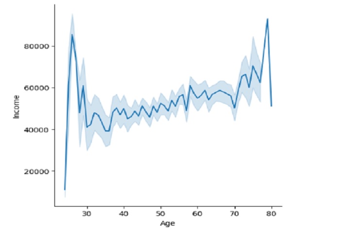
graphic_date.plot(x='Customer_Days', y='Income', kind = 'line')
OUTPUT
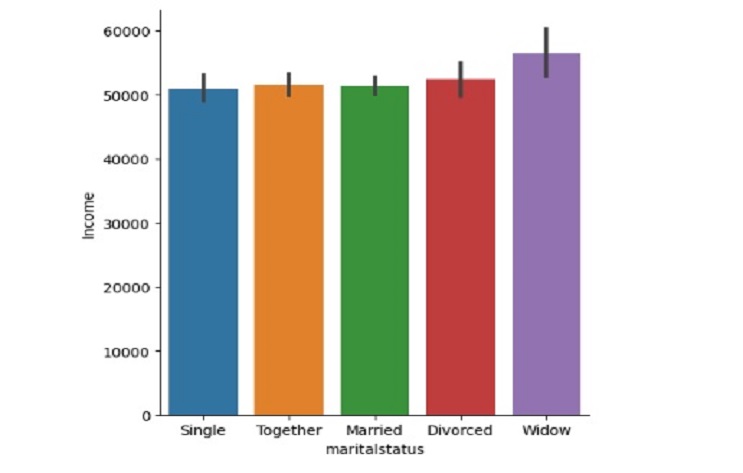
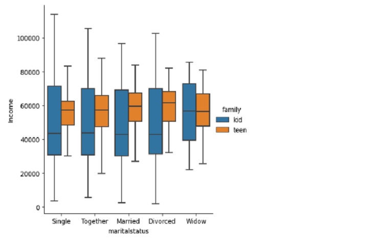
sns.catplot(x='maritalstatus',
y='Income',
data=marketing1,
kind='box',
hue='family',
sym="")
plt.show()
OUTPUT
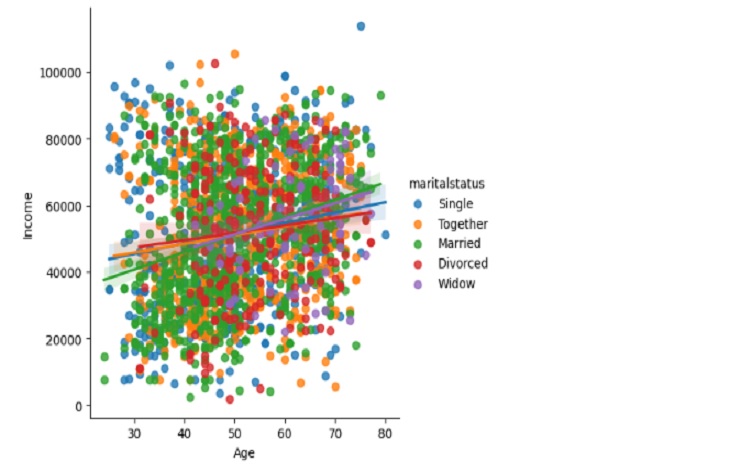
sns.lmplot(data=marketing1,
            x="Age",
            y="Income",
            hue="maritalstatus")
plt.show()
OUTPUT
