- 23 Oct, 2023
- read
- Karolinehc
Categories: Marketing Analytics Python Projects
Tags: Customer Conversion Data Visualization Marketing Campaign Pandas Seaborn Matplotlib Data-driven Decisions Python
The content presented in this article is intended solely for academic purposes. The opinions expressed are based on my personal understanding and research. It’s important to note that the field of big data and the programming languages discussed, such as Python, R, Power BI, Tableau, and SQL, are dynamic and constantly evolving. This article aims to foster learning, exploration, and discussion within the field rather than provide definitive answers. Reader discretion is advised.
import pandas as pd
import numpy as np
import seaborn as sns
import matplotlib.pyplot as plt
from statsmodels.formula.api import ols

campaing = pd.read_csv(r'D:\helen\Documents\PythonScripts\datasets\marketing\campaing4.csv')

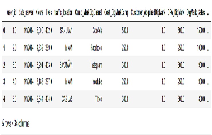
campaing.head()
OUTPUT

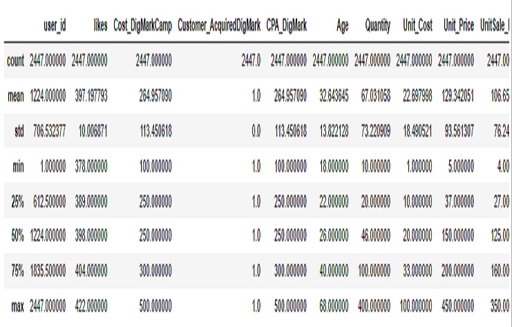
campaing.describe()
OUTPUT

Now this code reads a CSV file containing marketing campaign data, converts certain date columns to datetime format, adds a new column representing the day of the week when subscriptions were made, and provides an array of unique values for the days of the week.
campaing = pd.read_csv(r'D:\helen\Documents\PythonScripts\datasets\marketing\campaing4.csv',
parse_dates = ['date_served', 'date_subscribed', 'date_canceled'])

campaing['daysubsc_week'] = campaing['date_subscribed'].dt.dayofweek

campaing.daysubsc_week.unique()

array([1, 4, 2, 0, 3, 6, 5])
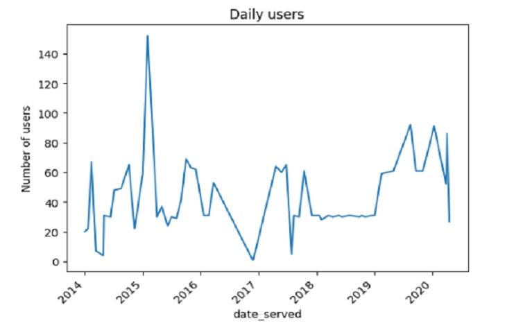
How many users are seeing the marketing assets each day how effective our marketing efforts have been over the past month.
daily_users = campaing.groupby(['date_served'])['user_id'].nunique()
print(daily_users.head())
date_served
2014-01-01    20
2014-01-21    22
2014-02-12    67
2014-03-12     7
2014-04-27     4
Name: user_id, dtype: int64
Now, lest creates a line plot to visualize the daily user trends. The plot includes a title, labels for the x-axis and y-axis, and rotated x-axis tick labels to enhance readability.
#To make it easier for you and your business stakeholders to notice subscriber trends, you will visualize your results using a line plot.
daily_users.plot()
plt.title('Daily users')
plt.ylabel('Number of users')
plt.xticks(rotation = 45)
plt.show()
OUTPUT

Calculating conversion rate how a marketing campaign performed, how effective a marketing team was at gaining new customers
total_marketed = campaing['user_id'].nunique()
Who_subscrib = campaing[campaing['converted']==True]['user_id'].nunique()
conversion_rate = Who_subscrib/total_marketed
Conversion rate is the percentage of the users who saw our marketing assets and subsequently became subscribers.
print(round(conversion_rate*100, 2), "%")
Output
70.21 %

print(total_marketed)

OUTPUT
2447

print(Who_subscrib)

1718
Lest create a new column in the campaing DataFrame that groups ages according to the specified age ranges, using the pd.cut() function.
campaing.Age.unique()

OUTPUT

array([18, 19, 20, 21, 22, 23, 24, 25, 26, 27, 28, 29, 30, 31, 32, 33, 34,
35, 36, 37, 38, 39, 40, 41, 42, 43, 44, 45, 46, 47, 48, 49, 50, 51,
52, 53, 54, 55, 56, 57, 58, 59, 60, 61, 62, 63, 64, 65, 66, 67, 68],
dtype=int64)
Define the age ranges and their corresponding labels
age_dict = {"18-24": "18-24", "25-30": "25-30", "31-36": "31-36", "37-42": "37-42", "43-47": "43-47",
"48-52": "48-52", "53-57": "53-57", "58-62": "58-62", "63-68": "63-68"}
Create the new ‘age_group’ column using pd.cut()
campaing['age_group'] = pd.cut(campaing['Age'], bins=[18, 24, 30, 36, 42, 47, 52, 57, 62, 68], labels=list(age_dict.keys()))
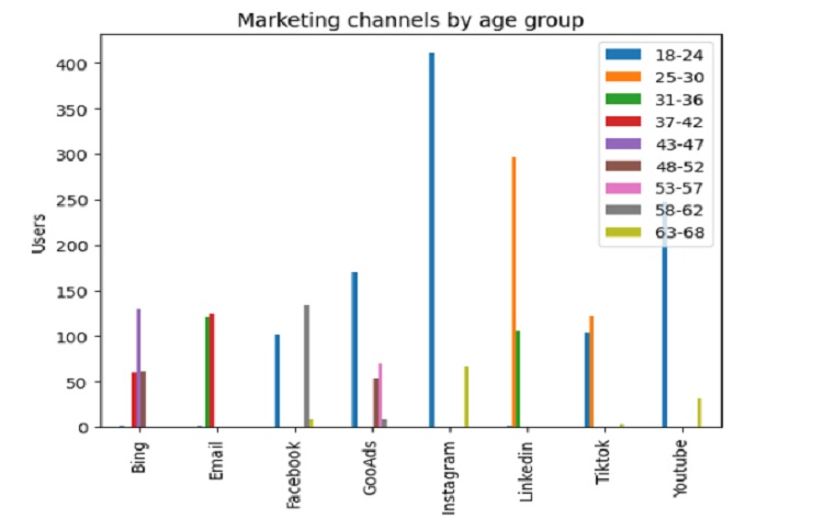
Lest see the result in a visualization
channel_age = campaing.groupby(['Camp_MarkDigChanel', 'age_group'])\
                                ['user_id'].count()

# Unstack channel_age and transform it into a DataFrame
channel_age_df = pd.DataFrame(channel_age.unstack(level = 1))

# Plot channel_age
channel_age_df.plot(kind = 'bar')
plt.title('Marketing channels by age group')
plt.xlabel('Age Group')
plt.ylabel('Users')
# Add a legend to the plot
plt.legend(loc = 'upper right',
           labels = channel_age_df.columns.values)
plt.show()
OUTPUT
